

I hated this color my whole life. Then I changed my mind.
Making my peace with purple (sorry, Grimace)
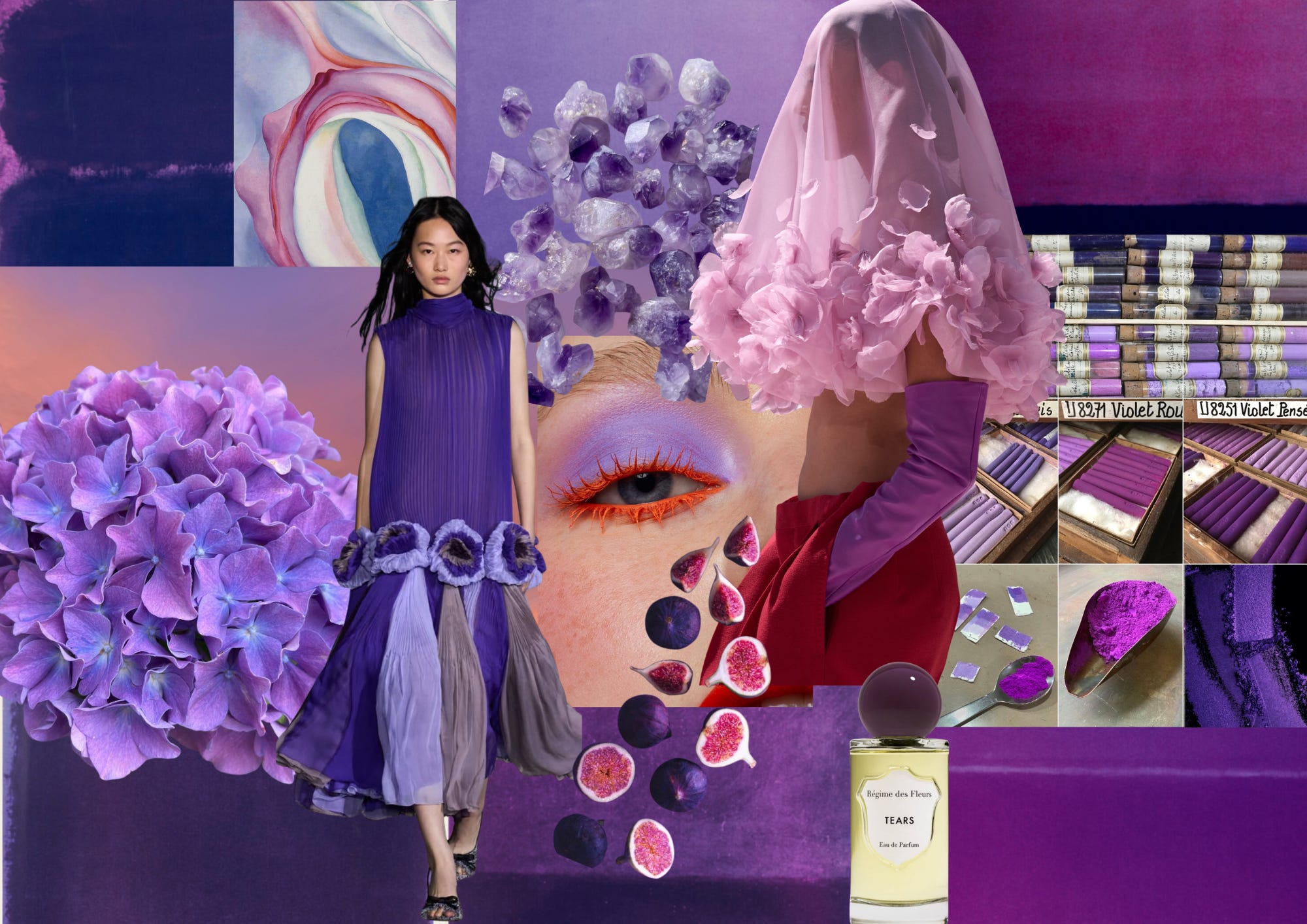
If you grew up in the 90s, a McDonald’s birthday party was a flex, and I wanted one badly. You got your own party space for an hour. You got games. Every kid who showed up got a Happy Meal and a free toy, which felt like winning the lottery.
I finally got my wish on my 5th birthday. My friends and I were deep into our Happy Meals and everything was going exactly the way five-year-old me had planned it. Then out of the blue, two more guests walked in to surprise me: Hamburglar and Grimace. Nobody told the birthday girl that they were included in the package.
I was so terrified I wanted to leave my own party. Grimace freaked me out the most. That ambiguous purple blob with limbs and creepy eyes disturbed me to my core. (Did you know it’s supposedly an engorged taste bud?? EW.) But I hadn’t had my birthday cake yet, and I wasn’t about to miss my candle-blowing moment, so I stayed. Reluctantly.
And that, is the origin story of how I came to dislike the color this entire letter is dedicated to :)
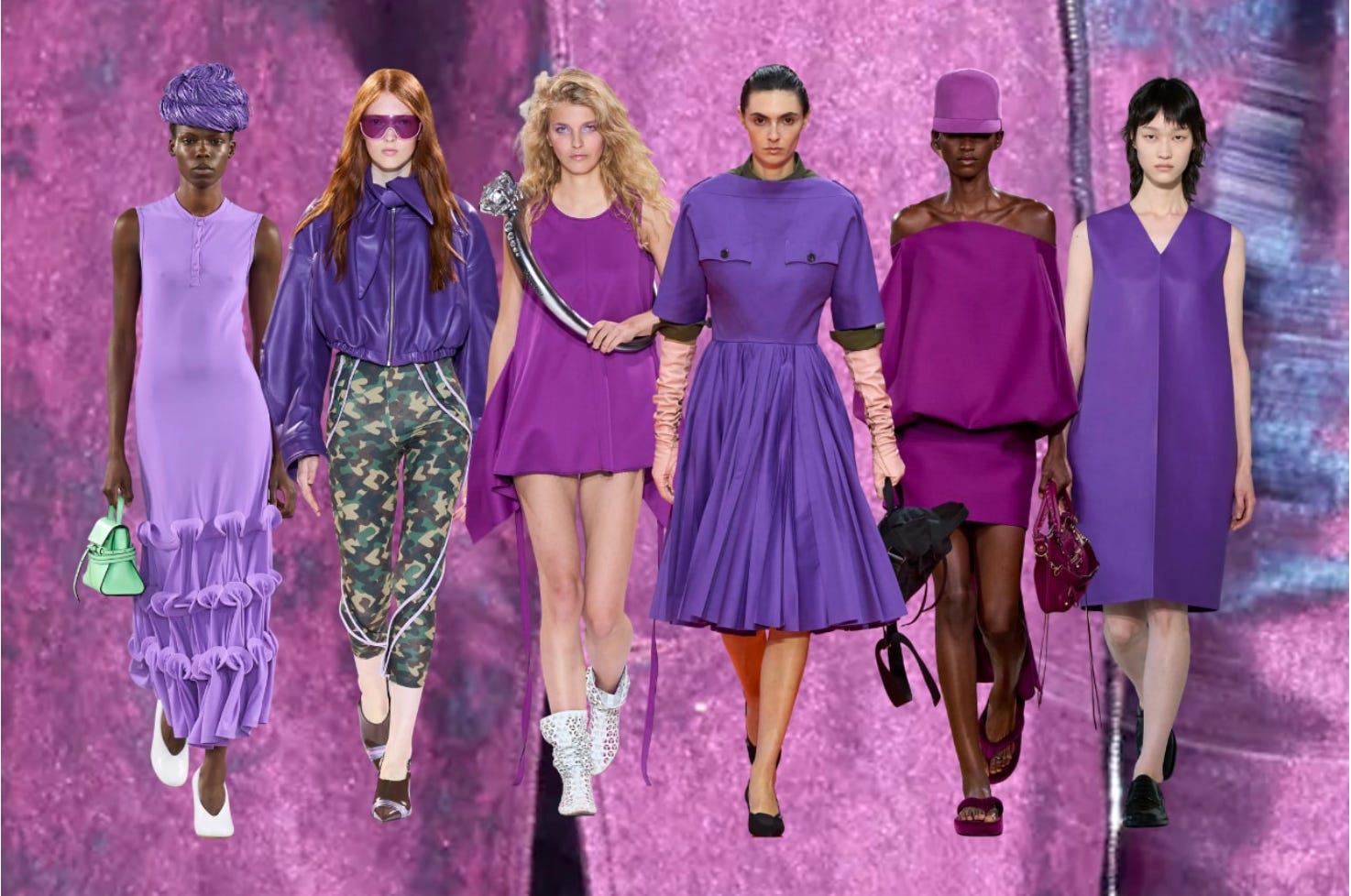
Perhaps my go-to pop of red has been feeling stale lately. Or maybe I’m just overexposed to the trend cycle. I also went to the Matisse exhibit at SF MoMA a few weeks ago and stood in front of Femme au chapeau for way too long.
It also doesn’t help that my notes feed has been nothing but joy-inducing color inspiration lately (Ritika is a major inspo). Either way, I’m now embracing the color I’ve avoided for most of my life. Shout out to free will. We can change our minds!
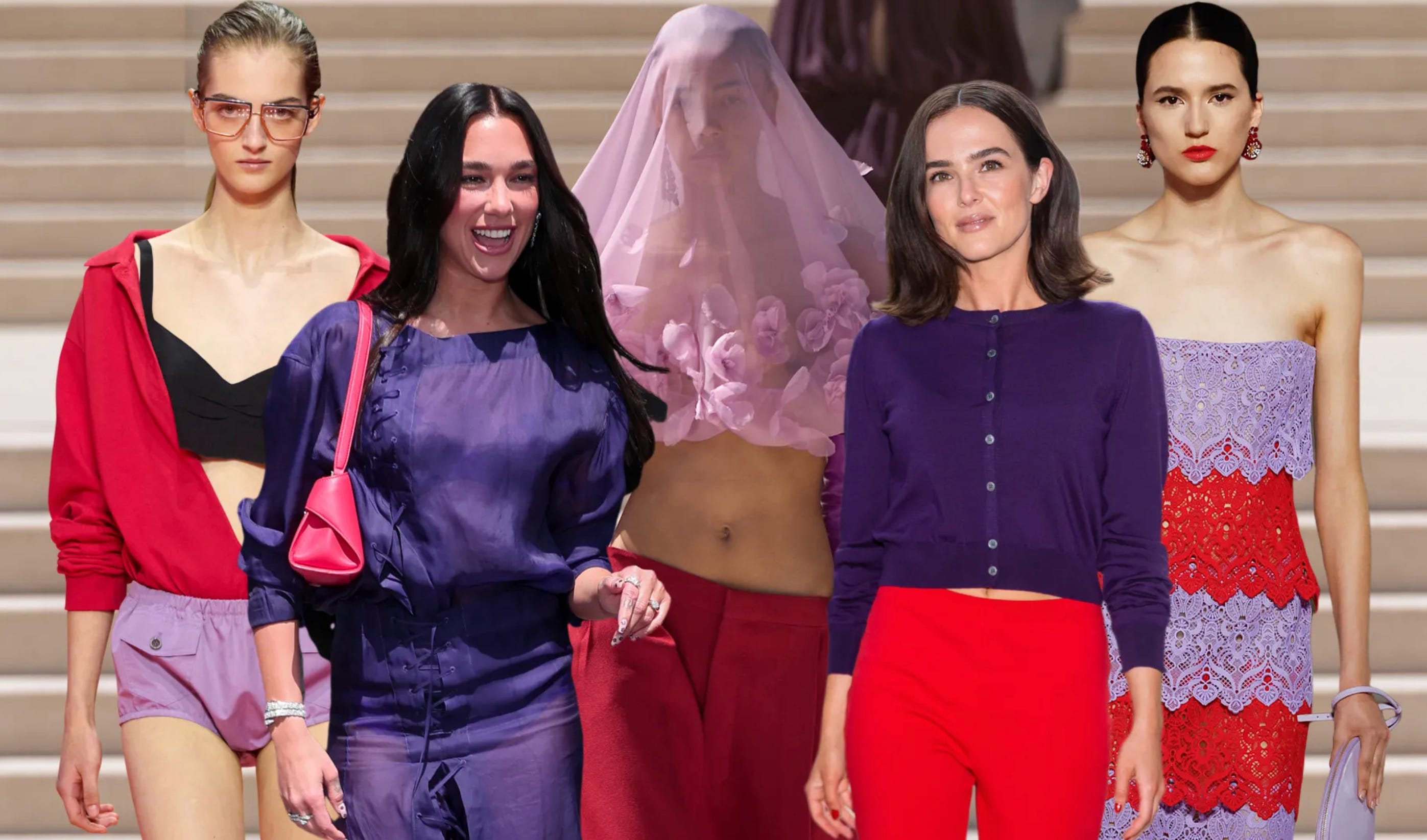
Since last year I’ve noticed this color move through the SS’26 runways: Moschino, Jil Sander, and Prada in Milan, Zomer and Balenciaga in Paris. Not the soft pastel that shows up every spring but more of the saturated, slightly aggressive purple — the one that reminded me of Grimace before it made me think: chic.
After years of quiet-luxury beige, color is clawing its way back, and purple is where designers are testing how loud we’re willing to go.
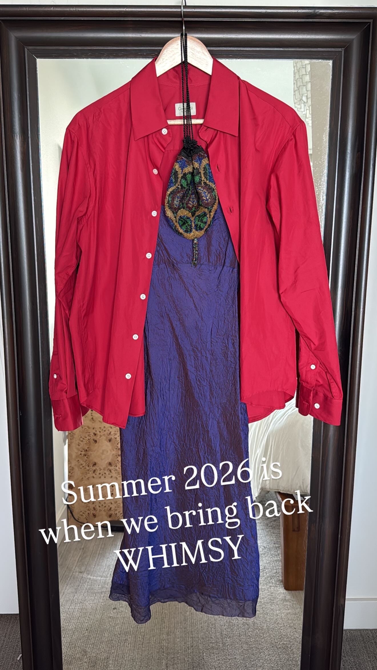
We all know that fashion has a track record of dragging back the trends we spent years side-eyeing. Everything always comes back around with a fresh perspective, and this time, this color is not showing up alone. Purple and red have been spotted together everywhere this season: Balenciaga sent tomato red trousers down the runway with purple leather opera gloves. Prada, Celine, and Auralee kept pairing the two saturated hues for spring.
This tracks for me as it’s the combo I reached for the second I felt compelled to give purple another shot.
History and Symbolism
I’m going to channel Rose Florence for a moment here. She’s the brain behind The Rose Period, my favorite newsletter on art history. I always feel smarter after reading her letters.
Did you know purple used to be worth more than gold? Tyrian purple, the original dye, came from crushing thousands of predatory sea snails for a single garment’s worth of color, which meant only royalty could afford it. Priests wore it too, and since royals were considered divinely appointed, it became a symbol of both status and spiritual authority.
Apparently it’s also the lucky color for my Sagittarius sun and moon, so I’ll take that as my excuse. The color I spent my whole life avoiding has been signaling power and status for centuries, and I’m just a few thousand years late to it.
Tints, Shades, Tones
Adding black, white, or gray to purple creates a completely different color story.
If you’ve been reading my letters for a while, you know that I don’t really believe in following rules around style or color. My only rule is: wear whatever it is you feel good in. Period.
But if you’re serious about your color analysis and want a starting point, here’s how tints, shades, and tones tend to play out.
White + Purple makes a tint = lilac, lavender, mauve. These lean cool and low-saturation, which tends to favor lighter, cooler undertones. If you’re a summer or a light spring, this is your entry point into purple.
Black + Purple makes a shade = eggplant, plum, indigo. Deep and saturated, these need contrast to hold up against your coloring. Winters and deep autumns can wear these close to the face; lighter coloring usually works better with it as an accent.
Gray + Purple makes a tone = muted, dusty, low-contrast hues (Ring 3 if you speak Tibi.) This is the most forgiving of the three since gray-based colors tend to sit gently against most skin without fighting it. If you’re not sure where you land, tone is the safest place to start.
How to wear purple
Whether you’re just dabbling in pops of color or feel ready to actually expand your combos, I broke it into different levels: dip a toe in, or go all the way to the deep end. Your call.
Most people tend to pair purple with white or black. It’s not wrong, but it’s predictable, and those pairings create a harsher contrast than you’d expect. Every look below is a more interesting way in.
Level 1
This isn’t exactly revolutionary. If you’re already rocking a pop of red these days, just swap it out for purple. If this is your first real venture into color, accessories are the lowest-risk, lowest-effort way to try it. You’re not committing to anything, it still moves the needle, and you can take it off if it’s not working.
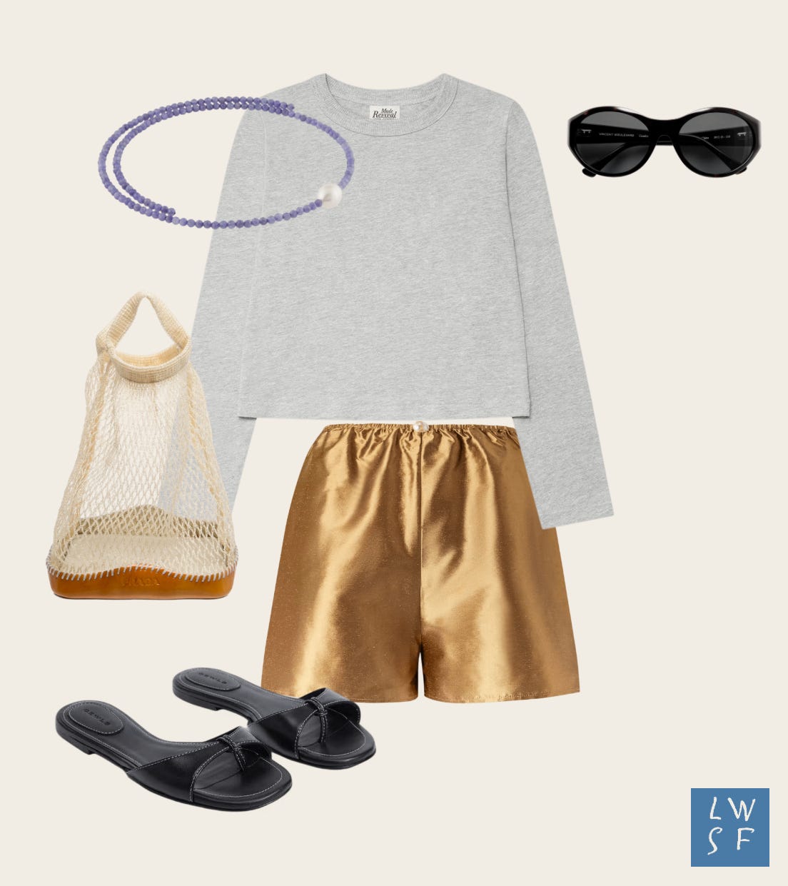
A soft purple choker against a gray tee gives you a subtle pop, barely-there color. If you want more contrast, go for a darker necklace instead (or this for a bolder statement.) A purple earring works too, if that’s more your speed.
If you’re not sure about wearing a new color so close to your face, start with a bracelet. Or just get a pastel mani (or pedi) and call it a day!
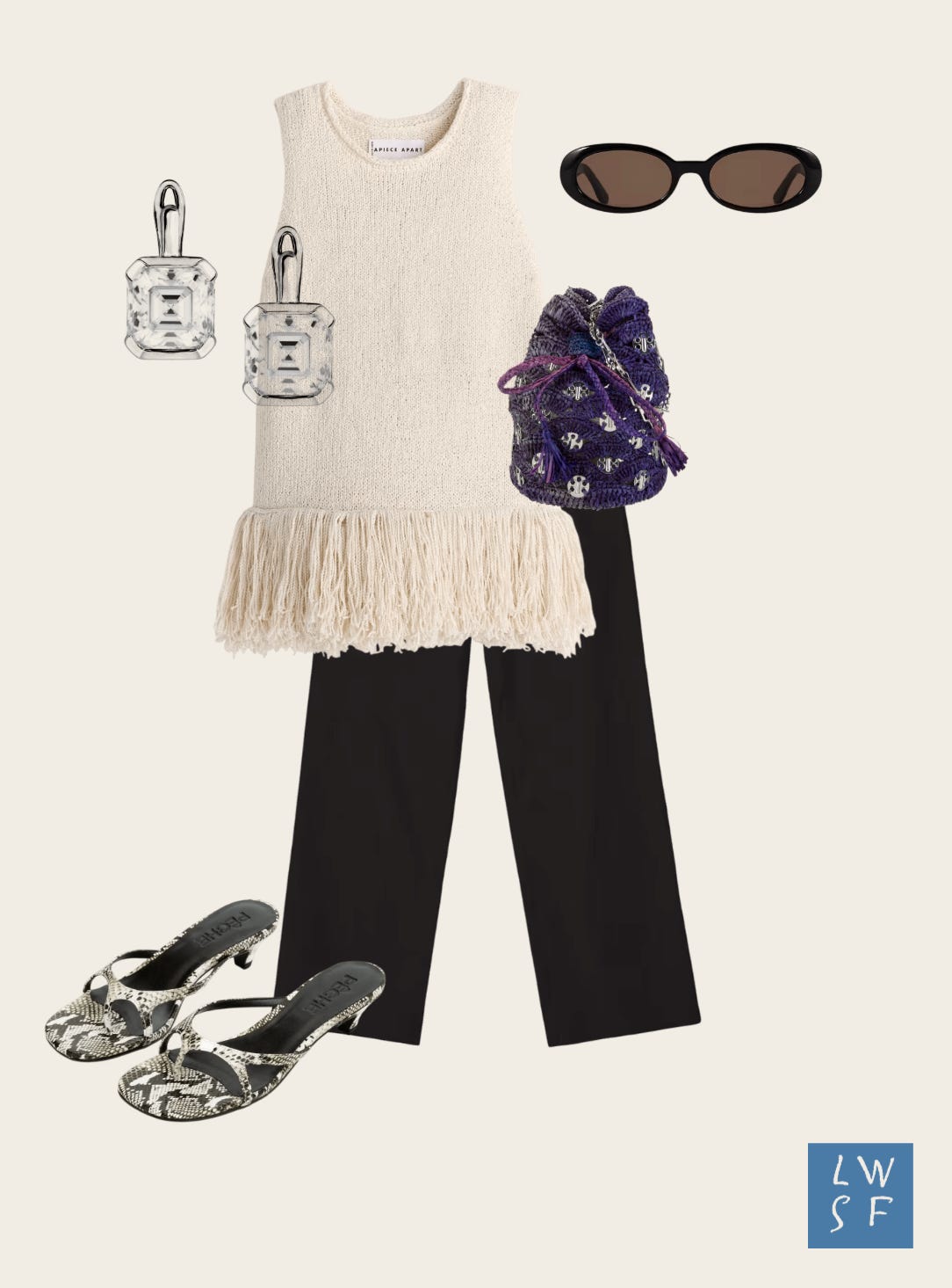
If you’d rather stick to your classic gold or silver jewelry, try a pop of purple through a bag instead. This deep purple raffia bag pops against cream and black, with the cream keeping the contrast from going too sharp. The raffia adds texture on top of the color.
Level 2
We’re taking it up a notch here, introducing purple as the main character alongside some supporting color contrast. I’ll explain the rationale with a little bit of Tibi-speak.
A quick primer if this is new to you: the Tibi Color Wheel sorts colors into four rings: Ring 1 is black, Ring 2 are neutrals, Ring 3 are the “no-color colors” (gray-ish, brown-ish, purple-ish, etc.), and Ring 4 are the saturated and pastel hues.
The theory behind Tibi’s Color Math is that the closer two rings sit to each other, the calmer the pairing feels. The farther apart, the bolder the statement.
Color communicates mood, and which one you reach for depends on how you want to feel that day. Low contrast pairings read calm, easy, and approachably confident. High contrast reads bold and energetic, like you mean business. For level 2, we’re exploring combos that fall somewhere between high and low.
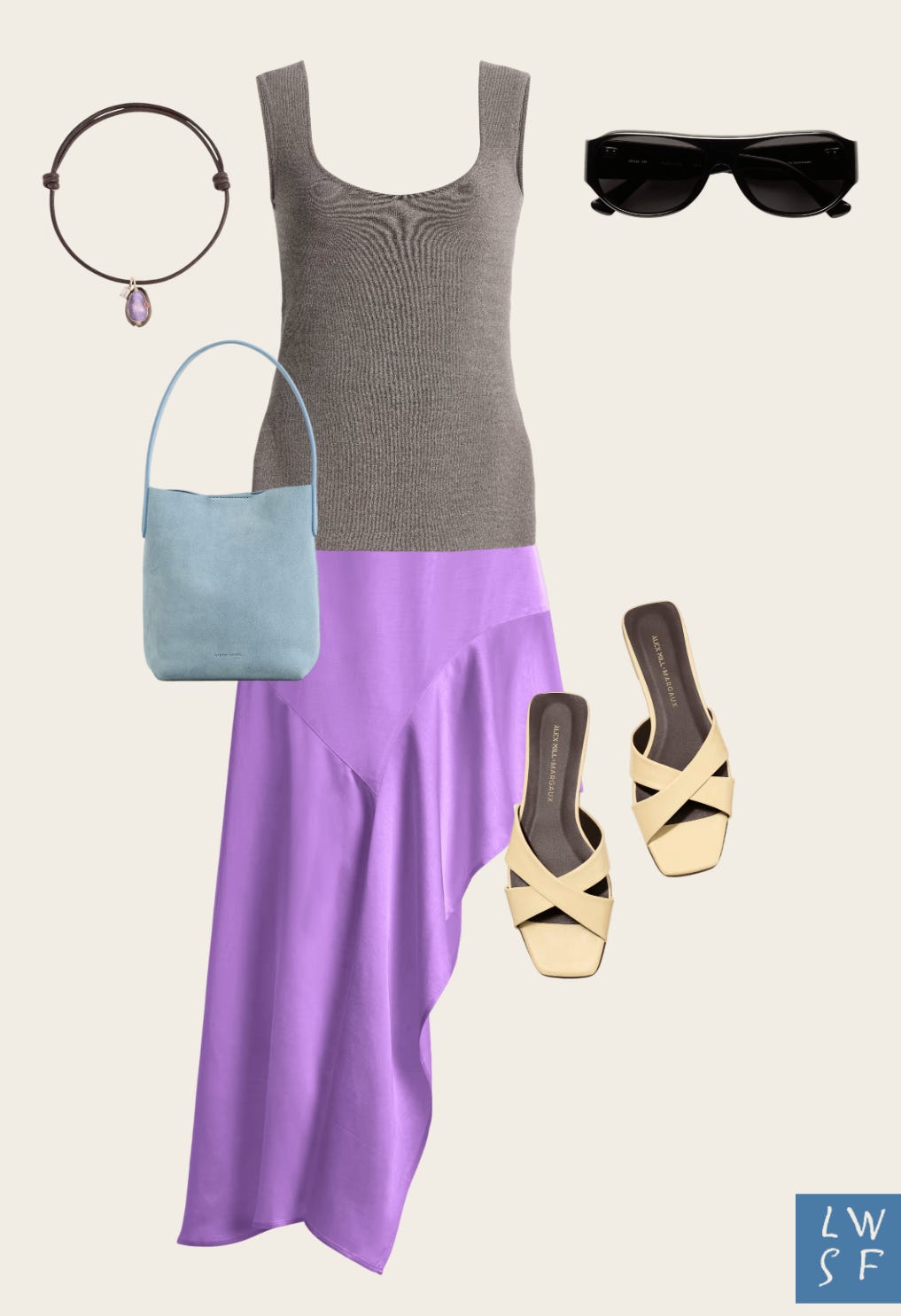
The taupe-y gray tank (ring 3) grounds the brighter orchid skirt (ring 4). I added another purple element here with the cord necklace to create some interest up top, subtle enough to echo the skirt without competing.
The buttercream sandals are the single warm note in this look, which keeps things from feeling too cold overall. Blue and purple sit right next to each other on the wheel (analogous), so the baby blue bag isn’t a random choice. It’s basically pulling from the same family as the orchid, just a shade cooler.
If all of this feels too advanced, tone it down by swapping the shoes and/or bag to brown tones. On the flip side, if you’re feeling more adventurous, opt for black or white to create a graphic-forward contrast. Black adds edge while white adds some brightness and tends to feel more directional.
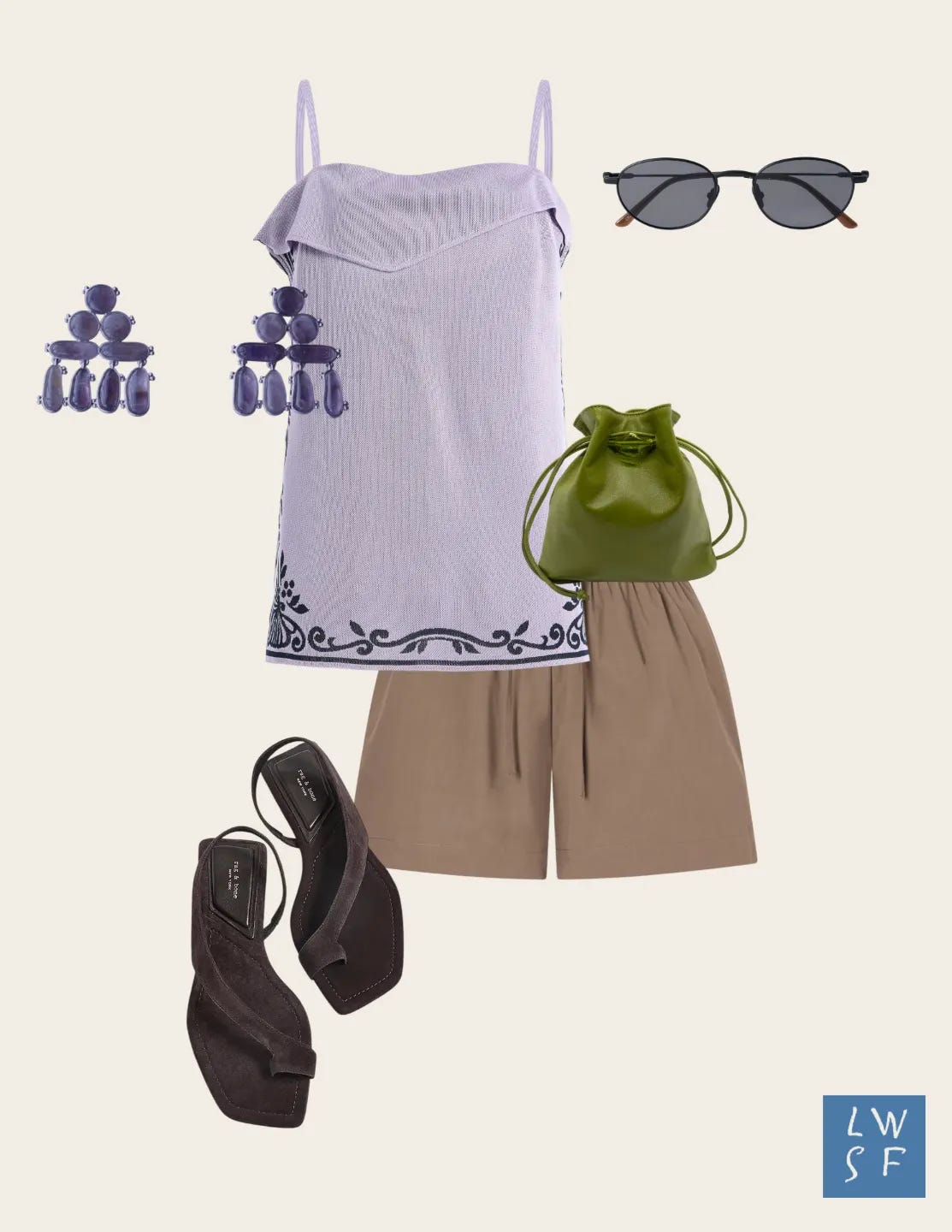
Rings explain why the last look felt cohesive. This one uses the same ring logic, plus a second consideration: temperature.
Lavender (ring 4) against khaki shorts (ring 3) and chocolate suede sandals (ring 2) is still considered a mid-contrast pairing. But it’s also splitting the top and bottom by temperature: the tank, earrings, and sunglasses stay cool from the shoulders up, then everything flips warm below the waist including the green leather pouch.
The takeaway: the whole outfit doesn’t have to agree on temperature but it just needs to commit to a clean split instead of scattering cool and warm throughout.
Level 3
OK, now we’re in the deep end.
The trick to wearing multiple saturated colors is two-fold: bridge the bold hues with a splash of neutrals (ring 2) or an “-ish” color (ring 3), and let scale do some of the work. One saturated color should lead, usually the piece with the most surface area, while the rest should be smaller in scale.
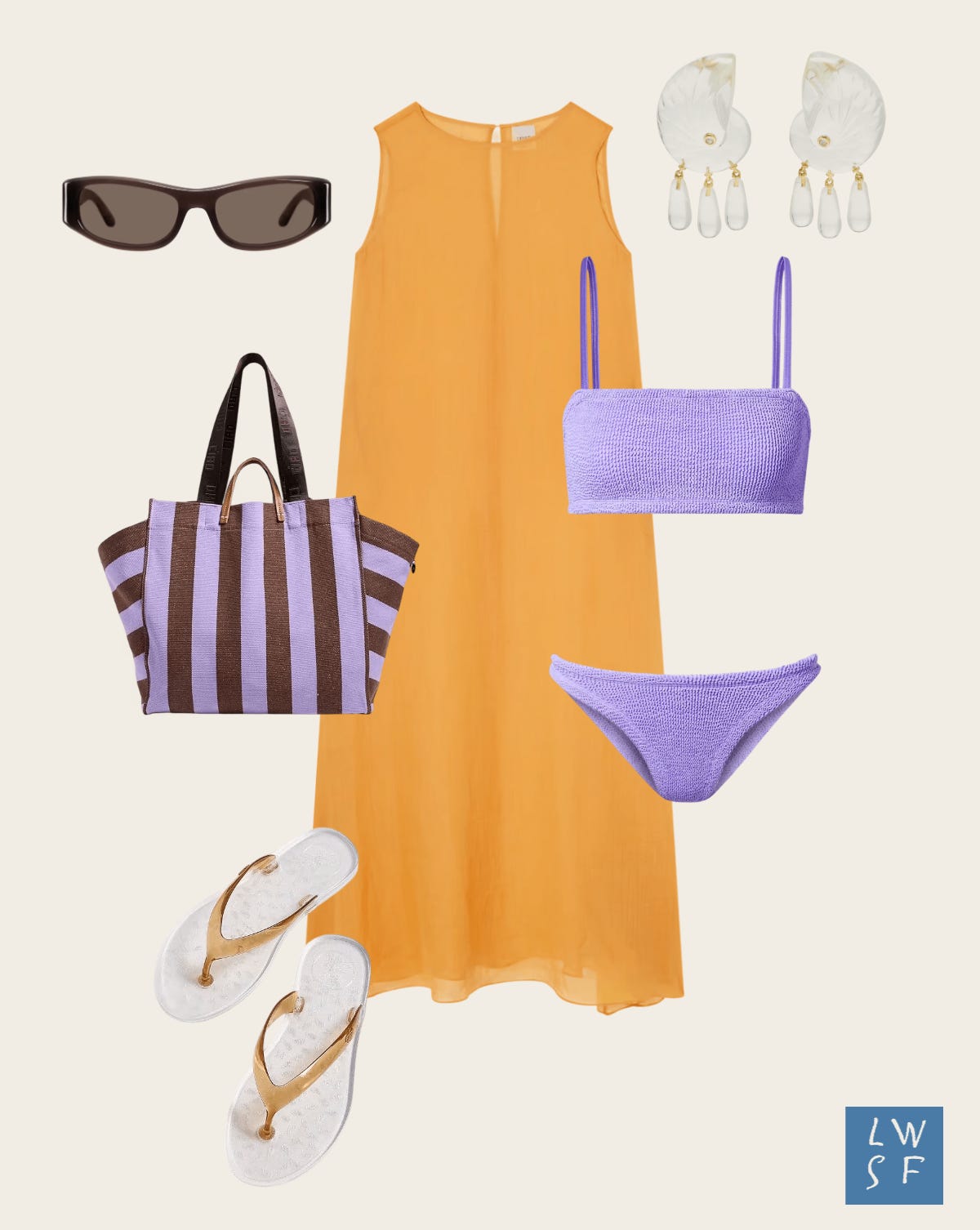
Yellow is technically purple’s complementary color but that combo can easily veer into Lakers territory. Skip true yellow. Try a yellow-adjacent shade like marigold instead — close enough to get the same effect, minus the mascot energy.
The dress is the main character here, claiming the biggest surface area and setting the tone for the whole look. The swimsuit plays the supporting role, just showing through the sheer dress for a soft contrast.
Adding the striped tote creates a bolder contrast against the marigold at a smaller scale. The brown stripes bridge the two saturated colors while the sunglasses echo the warm tones. The rest of the accessories create more interest without competing for attention.
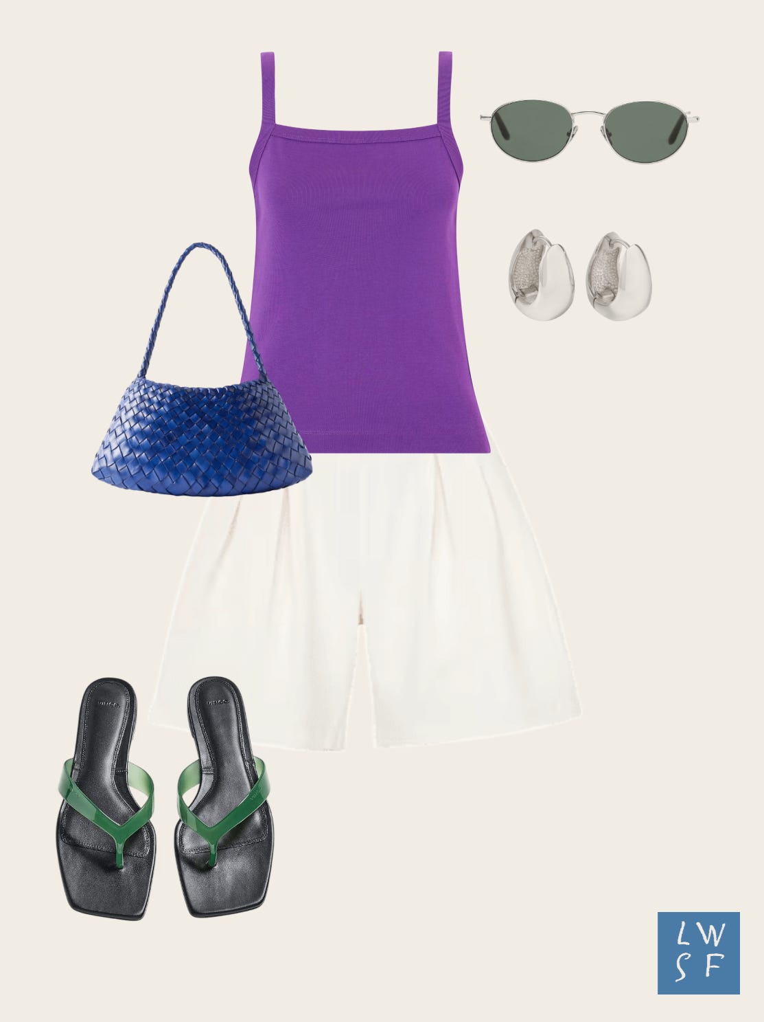
A true saturated purple (ring 4) tank leads as the loudest element in the outfit. The shorts are technically in ring 2, but ivory is warmer than white, so the purple reads bold without the harshness.
Cobalt and green are both ring 4 and analogous to purple. They work as accents despite being saturated, because the scale keeps them in check.
Levels 1, 2, and 3 above were the foundation. For paid readers, I’m taking each one a half-step further: a Level 1.5, 2.5, and 3.5. That includes a head-to-toe purple that somehow doesn’t scream Grimace, and a print-mixing moment for the maximalist.
If Grimace could see me now….
That’s everything I’ve got on purple. If you try any of these combos, I want to see them. Tag me or slide through my DMs.
xx Angela
LOVED this. I randomly got my colors analyzed this winter on a lark with a friend, and purple was a shocking winner for me. I did leave thinking "how on earth am I going to incorporate true purple into my wardrobe?" ANSWERED.
The way you've styled these pops of purple feels accessible at every level and I love how you've combined it with blue. I have a jacket with purple bow tie accents on my TRR wishlist rn, you might have just edged me closer to adding it to cart. And I had to laugh at the fun fact re: Grimace, I didn't know that!